Thursday 26 June 2014

My Film Poster & Evaluation


Evaluation:

The poster I made features a silhouette of a girl from the picture I took. I chose to place her directly in the middle of the poster to illustrate that this character is alone on her journey; it conveys the loneliness of the universe. All of the stars make this poster what it is - a visually stunning spectacle. It tells you right away what the story will consist of, from just the visuals alone. The colours and stars go perfectly with the title of the film, and gives the poster a sense of beauty. I wanted to use a silhouette because I thought that would be more interesting than showing her face; it has a sense of intrigue there and doesn't just give you everything on a platter.

The film features a strong female protagonist, which is quite the rare jewel in current times. They are rarely portrayed in the best way; only few master it. I think young women in particular will enjoy this poster because they can relate to it, and the idea of a well-rounded female heroin is likely to appeal to them; it's an opportunity to show us that, like in real life, women are or should be seen as equal to men. So it'll without a doubt appeal to that demographic the most. Despite this, I do think the young male demographic will take an interest as well, as many men want to see women portrayed fairly on screen - and besides who doesn't like a good space adventure? In comparison to a professional film poster this doesn't feel like an amateur created it. Specifically, it borrows from the Catching Fire poster with the female in the center surrounded by whatever they are associated with; for katniss it's fire and for this character it's stars and space.

The process wasn't as long as I thought it would be. Photoshop always seems like a daunting task for me because I'm not that confident with using it. However, this task did not require a lot of skill; the premise was quite simplistic - make a poster that is catchy and has meaning behind it in terms of what the film is about. I'll admit the poster took longer to complete than anticipated, but it all came together in the end.

I'm really pleased with the final outcome because it embodies that feeling of mystery and the film is a about a great mystery in space. Granted, space is full of mysteries but that's how I'd pitch the film to a production company. I enjoy looking at this poster because it's visually impressive, as a result of the colours - a mix of purples, pinks and blues. You could say the poster hasn't got enough content on it, but I believe it's better to be simplistic than overwhelming and have too much happening in the poster that is get confusing, so in conclusion sometimes less is more.

Thursday 19 June 2014

Editing


I copied and pasted a picture of shattered glass and layered that with the picture of Katniss. I selected 'screen' on the list of blending options.


I used the Spot Healing Brush Tool to erase some of the birds. Then I used the Healing Brush Tool to have multiple copies of the same bird.


Movie Posters


I chose this poster because I think it really captures the feel of the movie and the character's strength. The colours contrast each other and the fire jumps out at you against the black. I think it's a strong poster that draws people in. Her being placed inside the Mockingjay makes it clear that she is the centre of the story.


I chose this as the second poster example because I like how the shadows are used to great effect. Half of her face is blue and half is normal, and the shadows around her neck and hair convey a darkness growing in her. The colours are strong and the poster captures your attention as it's a close-up of her face which makes you contemplate how she could be feeling. The contrasting colours could also mean conflict in the character, which is always intriguing. Given that she is a fan favourite I think it was clever to use her in the marketing for the fourth season.


I chose this as my final example because it features all of the main characters and that combined with the scenery makes for an epic spectacle. The colours are very Lord of the Rings, with the greens, browns and greys. It looks fantasy and there is a lot happening in the poster, from Frodo and Sam's quest, to Aragorn rising up to the challenge as King. The mood is quite dark because of how serious the situation the story takes place in. The mood gets dark with every film as they get closer to Mordor. The way the characters are positioned is interesting; there's Frodo, Sam and Gollum in one corner with the eye of Sauron watching over them, and then we have Aragorn, Gandalf and the others in the top left-hand corner, Aragorn being bigger than the others. This is a good way of showing two of the most important characters in the trilogy.


Thursday 1 May 2014

Robert Capa/Tony Vaccaro

Describe the different circumstances that these photographers experienced as Photojournalists in WW2.


Robert Capa moved from New York to Paris to escape Nazi persecution. He was sent to various parts of the European Theatre. Capa was a war photographer and became famous for capturing the ultimate and decisive moments in war. He was considered the world's greatest war photographer. On D-Day, under constant fire, Capa took 106 pictures - he was willing to risk his life to capture these decisive moments in war. He originally wanted to be a writer and then he found photography work in Berlin and fell in love with the art.

Vaccaro fought in 1944 and 1945 as a private in the 83rd Infantry Division of the U.S. Army in Normandy and then in Germany. Him being a scout left him enough free time during the day to take photos. By the end of the war in Europe he became an official photographer for the division's newspaper.

Vaccaro photographed throughout Germany and Europe; after he returned to the US he worked for Life and Look before joining the magazine Flair. Photographs from his wartime archive were publishd in 2001 in his book Entering Germany: Photographs 1944-1949.


Find and upload to your blog some work of theirs.


Running for shelter during an air raid alarm.


A member of the American Medical Corps treats a German prisoner of war.


Fashion Photography


Fashion Photography has been in existence since the early days of photography. In the first decade of the 20th century, advances in halftone printing allowed fashion photographs to be featured in magazines.


When is an image a Portrait? When is it a fashion photograph? Are the two the Same?


A portrait is a picture of a person, capturing their personality and demeanor, focusing solely on their facial expression and what that expression determines of them. A fashion photograph is different in terms of using props and make-up in order to achieve the desired effect - it involves more manipulation as the photographs will be used to promote clothing lines. However, the two are also similar in terms of getting the "right look". In portraiture you need to capture the right facial expression in order to convey how the person is feeling, and in fashion photography they want the capture the right mood for the clothing they are advertising, using a variety of colours, clothing and props. A Portrait and a fashion photograph are viewed differently - when you look at a Portrait of someone the main focus is there face, specifically their eyes, and what they're wearing isn't as important as it is in a fashion photograph because the main focus in that is the what clothes the model is wearing and how they look on the model.


To what degree should an image be manipulated to go into a fashion magazine?

g
       Fashion magazines want to sell their clothing lines, so the clothes need to be modelled and promoted in the highest quality possible. This means that most of the time they'll need to play around with the images that are taken in order to enhance the quality of the content. I think this is fine, to an extent. I can tolerate a little face manipulation, but I don't condone the ways in which someone's body is  made to look drastically different to it's natural look. It just gives young girls the wrong idea about the "perfect look", when in truth there is no perfect look; we're built the way we're built and nobody should be ashamed of that. I know the heavy body manipulation will probably never go away, but I hope people can separate reality from fantasy.
g    
g
      
k


Is there a clash between the creative and commercial side of fashion Photography?


Fashion magazines need to manipulate images before they make it into the magazine, and that requires some creativity. There's the on-set manipulation with props, locations and make-up; and there's the computer manipulation in post-production. Both require a creative mind, but the former requires a little more. Just by choosing the location requires creativity because there has to be a reason for the shoot to take place there. It might tell a story or the location might go with the clothes the model is wearing - e.g. someone modelling a white outfit on the beach. When the magazines are advertised I think that is the least creative part of the process as it's sole purpose is to inform people about its existence. However, the effort put in to reach the target audience for the magazine can be seen on a somewhat creative level. So I do believe there is a small clash between both sides of fashion Photography.

Thursday 13 February 2014

Layer Masking

Layer Masking


I made it so the picture of Katniss fit the picture of the sunset and then I used the layer masking tool to get rid of the background. Lastly I used  the feathering tool to blend her into the sunset, to make it seamlessly blend into the sky.

Thursday 19 December 2013

Depth of Field


BEFOREAFTER

I used the Blur Tool with a ratio of 85% for the mountains and the clouds because they're further away, and a ratio of 50% for the hills and the trees. I didn't blur out the church because that's the area of emphasis, and I used the Sharpen Tool to define it.

Thursday 17 October 2013

Portraiture


Portraiture 


The difference between photojournalism and portraiture is that portraiture exists in a constructed world, where everything is put together to capture the sitter's personality, whereas photojournalism is about capturing the scene. 

Portraiture photographs have existed since the invention of the camera. The low cost of 


Tony Vaccaro's intention was to fool people into thinking their photograph wasn't being taken, and he wanted to present his own opinion of the person, so when he took the picture, the person would reveal a true part of them. Photography to him is a form of placing the person in the photograph on a pedestal, and capturing that decisive moment in which the person's personality is revealed. He didn't want to take pictures of people masking who they truly were; he had no interest in poses for the camera, and so he would take a picture of someone when they least expected it, when they weren't prepared for one. He thinks once you know someone's personality you have to think of a word that fits that personality, and for Picasso it was "suave", so you have to decide how to capture the meaning of that word.


There are many ways to light somebody's face when composing and capturing a portrait photograph. An example of a lighting technique is three-point lighting, which is using 3 or 4 lights to fully model the person's face. The different lights are Key-Light, which is the main light; Fill-Light, which is used to control the contrast of the scene; and Ascent-Light, which separates the person from the background so that it enhances the three-dimensional effect and allows us to can see the behind them.


Sunday 29 September 2013

Henri Cartier Bresson

  • Photojournalism - Explain what it is    
  -Photojournalism was born in the chaos of modern warfare. It consists of a photojournalist being assigned to         take pictures of a variety of situations, whether it be a crime scene or wedding. They just need to add a               visual element to whatever story is being printed


     Henri Cartier Bresson:

  • Why is he famous?

 He was one of the earliest pathfinders for street photography, and he helped develop the street                 photography or life reportage style that was made The Decisive Moment, which has influenced generations of photographers who followed. He is considered to be the "godfather" of modern photojournalism. 


  • Why is his work significant in Photojournalism?

He took some of the most influential pictures that spoke to people about important matters, such as the economy and early inventions that altered our way of life. His pictures were about being in the right place at the right time and he could see the theatrical potential in every shot. He covered many of the world biggest events from the Spanish Civil War to the French uprisings in 1968.


  • Find and upload to your blog some work of theirs
 

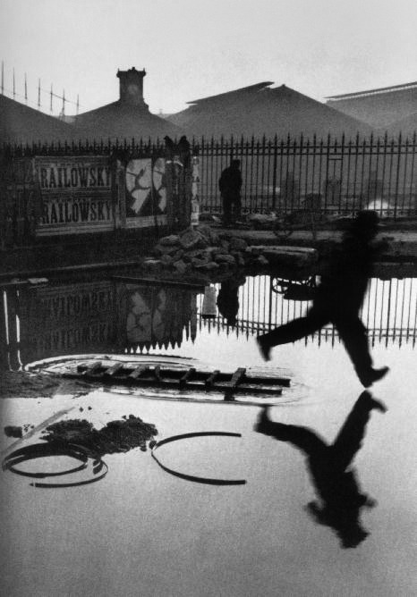
-Bresson took this photograph through a gap in a fence, and because the space between the planks was not wide enough, the left side of the image was later cropped. 

  • What Camera/Technique did he use

He was an early taker of 35 mm format, and was very skilled at candid photography, which is capturing an image without creating a posed appearance; everything is organic.